 Feature
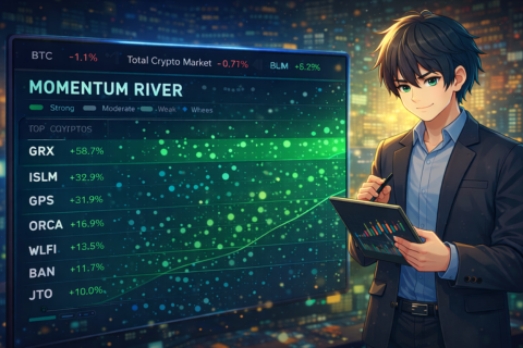
Momentum River: See Where Money Is Moving in Real Time
Most financial tools show you where money is — market cap heatmaps, price charts, static tables full of numbers. The Momentum River shows you where money is moving.
It's a real-time visualization that sits on the StockJelli screener page, turning raw momentum data into something you can understand in a single glance. No analysis required. No numbers to compare. Just watch the flow.
How It Works
Every stock or crypto that qualifies for the StockJelli screener gets its own lane in the river. Particles stream across the screen in each lane, and the behavior of those particles tells you everything you need to know about the move:
Speed = strength. A coin up 50% has particles racing across the screen. A coin up 4% is a slow trickle. You don't need to read a number to know which move is stronger — you can see it.
Width = volume. High-volume movers get thick, dense lanes packed with particles. Low-volume movers get thin, sparse lanes. This is critical because a 20% move on heavy volume is a fundamentally different signal than a 20% move on no volume. The river encodes that distinction visually — the thick, fast lanes are the ones that deserve your attention.
Color = direction and intensity. Strong bullish movers glow bright green. Moderate movers show a muted green-gold. Weak or bearish movers appear in red and warm tones. The color shifts with the strength of the move, so you can scan the entire river and instantly see which lanes are running hot.
Direction = momentum. Particles flow left-to-right for bullish momentum, right-to-left for bearish. Even the direction of flow communicates meaning.
The Two Sections
The river is split into two parts, and the relationship between them is where the real insight lives.
Top section: Individual movers. This shows the top 10 stocks or crypto assets currently on the screener, sorted by percentage change. These are the opportunities — the specific tickers showing the strongest momentum right now.
Bottom section: Market context. This shows broad market benchmarks flowing at their own pace. In crypto mode, you see BTC and Total Crypto Market. In stocks mode, you see NASDAQ and S&P 500. These lanes tell you what the overall market is doing.
The magic is in comparing the two. When the top lanes are racing with bright green particles and the bottom lanes are crawling or turning red, it means individual names are breaking out ahead of the broader market. That's the exact condition momentum traders look for — relative strength against the index. A stock outperforming a flat or declining market is a much stronger signal than a stock rising because everything is rising.
Conversely, when the bottom benchmark lanes are moving faster than the top individual lanes, it suggests the broader market is lifting everything — which typically means the momentum is macro-driven rather than stock-specific, and individual breakouts may not sustain once the tide turns.
What It Looks Like in Practice
Here's a scenario from this past weekend's meme coin surge. On Saturday, the crypto screener logged 248 entries — the busiest day of the week. If you had the Momentum River open, here's what you would have seen:
The top section would have been a wall of fast, thick, bright green lanes. Dozens of altcoins and meme tokens streaming across the screen at full speed, many with wide lanes indicating heavy volume. BERA, ME, TOSHI, VVV — all racing.
The bottom section — BTC and Total Crypto — would have been moving, but slower. BTC was up around 3–4%, not 50%. The total crypto market was rising, but not at the pace of the individual movers above it.
That gap — top section racing, bottom section walking — tells you instantly: this is a risk-on, altcoin-led rally. Capital is rotating into higher-beta names. The river communicated in two seconds what would take five minutes of scrolling through the data table to piece together.
Now imagine the opposite scenario: a quiet Tuesday where only 3 coins qualify for the screener, all with moderate gains. The river would show three thin, slow-moving lanes up top, and BTC crawling along at the bottom. The visual message is immediate: nothing is happening. Don't force a trade.
Why This Matters
Trading momentum is a speed game. The traders who do well are the ones who can quickly assess a large amount of information and focus their attention on what matters. The Momentum River is designed to compress that assessment into a glance.
A data table gives you precise numbers — and StockJelli's screener table still does that, sitting right above the river. But numbers require mental processing. You have to scan rows, compare percentage changes, check volume columns, and mentally piece together the picture. The river does that synthesis for you visually.
Think of it this way: the screener table is for analysis. The Momentum River is for awareness. Glance at the river to understand the moment — is the market active or quiet? Are individual names outperforming the index? Is volume behind the moves? — then drill into the table for the specifics on whatever caught your eye.
Reading the River: Quick Reference
Fast lane → Strong price movement (high % change)
Wide lane → High volume behind the move
Bright green → Strong bullish momentum
Muted / gold → Moderate momentum
Red / warm → Weak or bearish
Top racing, bottom slow → Individual breakouts outpacing the market (strong signal)
Bottom racing, top slow → Rising tide lifting all boats (weaker individual signal)
Everything slow and thin → Quiet market — don't force trades
Technical Details
For those who care about what's under the hood: the Momentum River is built on HTML5 Canvas with 60fps particle animation. Each lane's particles have subtle glow halos, and the lane boundaries undulate with layered sine waves for an organic, fluid feel — it genuinely looks like flowing water.
The visualization updates every 60 seconds in sync with the main StockJelli screener. It shows the top 10 movers sorted by percentage change, and automatically switches between stocks and crypto movers when you toggle modes. The benchmark data in the bottom section (BTC, Total Crypto, NASDAQ, S&P 500) is pulled from the same market data already displayed in the site header, so there's no additional latency.
One detail worth noting: the river automatically pauses rendering when your browser tab is hidden, so it won't drain your battery if you leave the screener open in a background tab. When you come back, it resumes instantly.
Where to Find It
The Momentum River appears on the main StockJelli screener page, positioned above the Market Pulse EKG section and above the blog/insights cards. It sits between the data table (precise numbers) and the Market Pulse (regime context), serving as a visual bridge — the quick-glance momentum snapshot that ties the whole page together.
It's available to all users — free and subscriber — with no feature gate. Open the screener and scroll down past the table, or just look for the flowing green particles. You'll know it when you see it.
StockJelli is an educational tool. This article is for informational purposes only and does not constitute financial advice.
Watch the river flow
Open the Screener